You don’t always have to think outside of the box when it comes to color. In fact, creating harmony within your design can be just as important as creating contrast.
Don’t be afraid of the obvious match-ups either, like black and white, especially in the modern world where pure white is seen as sterile and boring. When it comes to making things pop and stand out, there are plenty of ways to use our top ten best colors that match everything from background text color on web pages to accent pieces on a wall or even in clothing or jewelry.
Colors pairings that work well is a complex phenomenon and very hard to predict.
Because every individual perceives color differently, it is up to you as the designer to make sure you’re on track by determining how your users perceive and interpret color stemming from their cultural background along with their current mood at the moment. We’ve put together a list of ten colors that match everything, so all you need to do is pick out the perfect one from our list and get started.
Not everyone is born with a keen sense of color or a natural aptitude
Although not everyone is born with a keen sense of color or a natural aptitude for design, there are methods and principles you can employ to select the best color that matches together to make a strong impression and achieve your desired effect. Fortunately, we’ve got you backed up. The ten best colors that match everything are listed below to help you create your next design.
Color Combinations
Color is abundant in our life. Our moods, sensations, and perceptions, as well as our decision-making processes, are all influenced by color. Emotion evokes by color. It affects our perception, eliciting subconscious or conscious responses in the human brain. Color is perhaps the most robust tool at your disposal as a designer because of its influential and communicative nature.
What is Color Combination?
Color Theory is an art when it comes to playing with colors. It explains how people perceive color and the visual effects of colors mixing, pairing, and contrasting with one another. Designers use a color wheel and considerable collected knowledge about human psychology, society, and more to pick the perfect colors that match everything. Color is a crucial, if not the most important, feature of design since it may affect the meaning of the text, how people move across a layout, and how they feel. You may be more intentional in generating graphics that affect you if you understand color theory.
Types of Color Combinations
Learning how different colors match together is essential for successful color combinations. Studying the color wheel and color harmonies (what works, what doesn’t, and how color communicates) will help you blend colors, establish a stronger brand, and share more effectively with your designers and printers.
The color wheel contains:
- Three primary colors – Red, Yellow, and Blue
- Three secondary colors – Purple, Green, and Orange, and
- Six tertiary colors (colors generated when you mix primary colors), plus (colors created from primary and secondary colors, such as blue-green or red-violet).
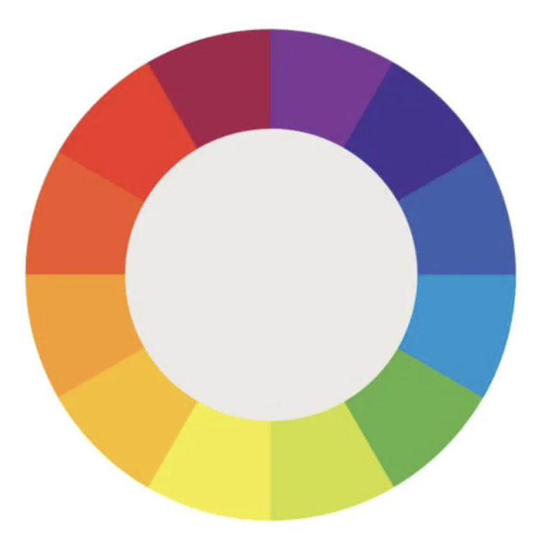
Draw a line over the core of the wheel to separate the warm colors (reds, oranges, and yellows) from the cool colors (blues, greens, and purples) (blues, greens, purples).
Warm colors are connected with activity, brightness, and vigor, whereas cold colors are associated with tranquility, peace, and serenity. So when you hold that color has a temperature, you can see how its use might influence your message.
On the color wheel, complementary hues are opposites. They may make artwork jump because of the great contrast between the two hues, but overusing them can get tiring. Analogous hues are next to each other. Therefore, one color will dominate, one will support, and another will accent when developing a similar color scheme.
Triadic hues are energetic and vibrant, evenly dispersed throughout the color wheel. They provide visual contrast and harmony, allowing everything to shine as the overall image comes to life. You can build a variety of grand color schemes by using the color wheel. Finding the perfect color combination for the right occasion is vital.
Yellow and Blue
Yellow is the ultimate attention-getter, and it provides a yellow backdrop for the commanding navy.
The equally electrifying Blue color that matches with Yellow dazzles the senses. It's one of those color schemes mainly used for parties and casual gatherings. It helps instill a sense of purpose and energy in a design by contributing to enthusiasm.
Brown and Orange
The vibrant orange contrasts wonderfully with the dark brown, providing a sense of mystery and suspense.
Lime Green and Purple
This high-octane color combination exudes a powerful presence, with purple being a beautiful choice to compliment light green. That color matches the lime green and presents a strong sense of design.
The choice is yours to decide. Colors have a significant role in your brand’s identification. After you’ve decided on the style of logo you want to employ, think about what each color will say about your business. Check for the feelings you want to evoke and how you want your customers to react to your brand. You can assist your brand leave a lasting impression and form a stronger connection with your audience by selecting the proper color combination.